Duckhams
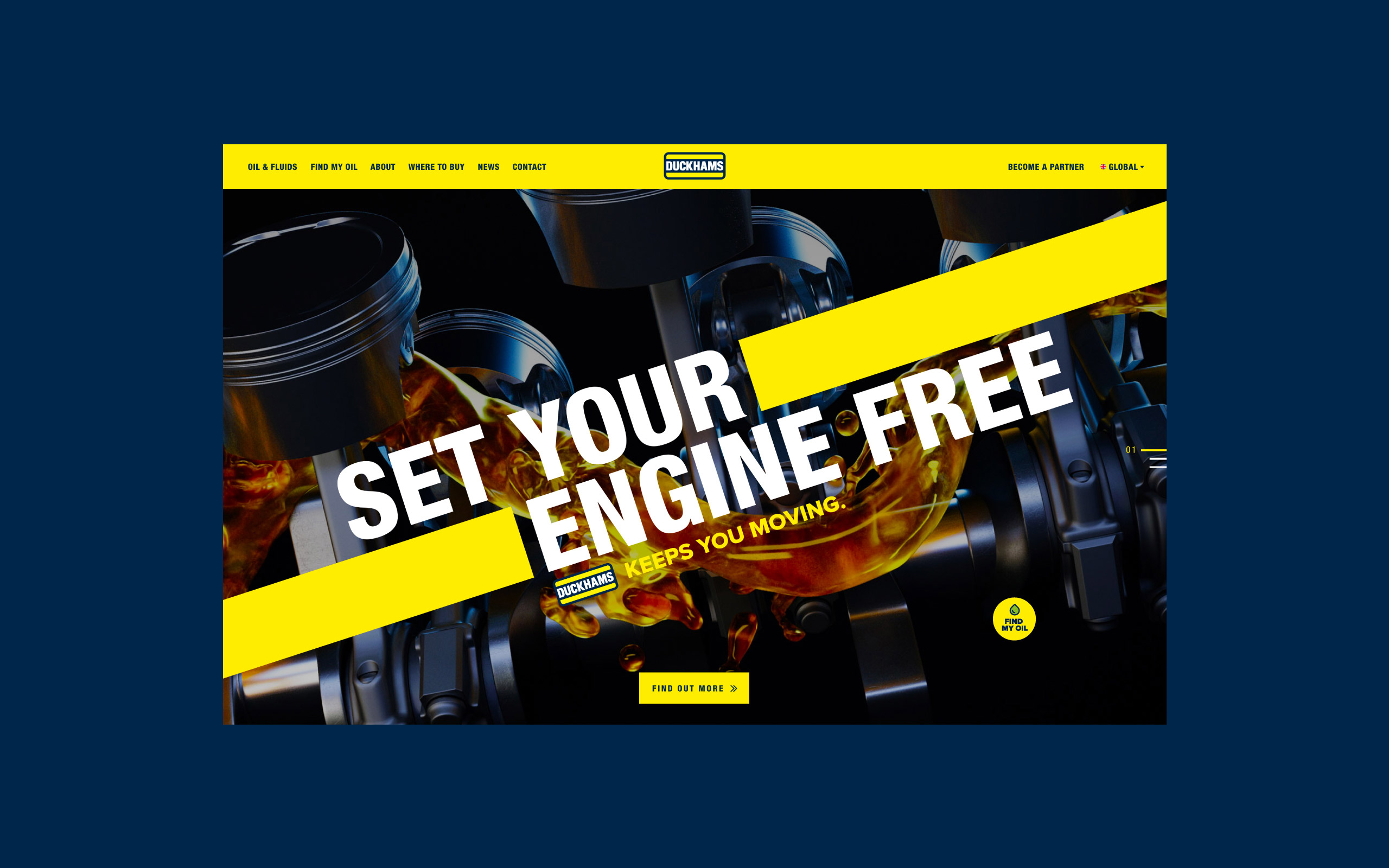
Duckhams has been a fixture of the lubricants industry for over 100 years, providing products for modern, industrial and classic cars, as well as Formula 1 racing teams. With such a decorated history, Duckhams needed a new website that offered flawlessly designed interactions and innovative features to communicate its position as an industry leader.

The challenge
Duckhams wanted a new website that looked modern whilst maintaining its illustrious heritage. It was also important to offer B2B clients a truly innovative feature whereby they could find the nearest stockist of the correct oil for their customers’ cars, using just a registration number. The website design had to sell the story of Duckhams, which goes back over 100 years, whilst incorporating highly functional microinteractions and animations.
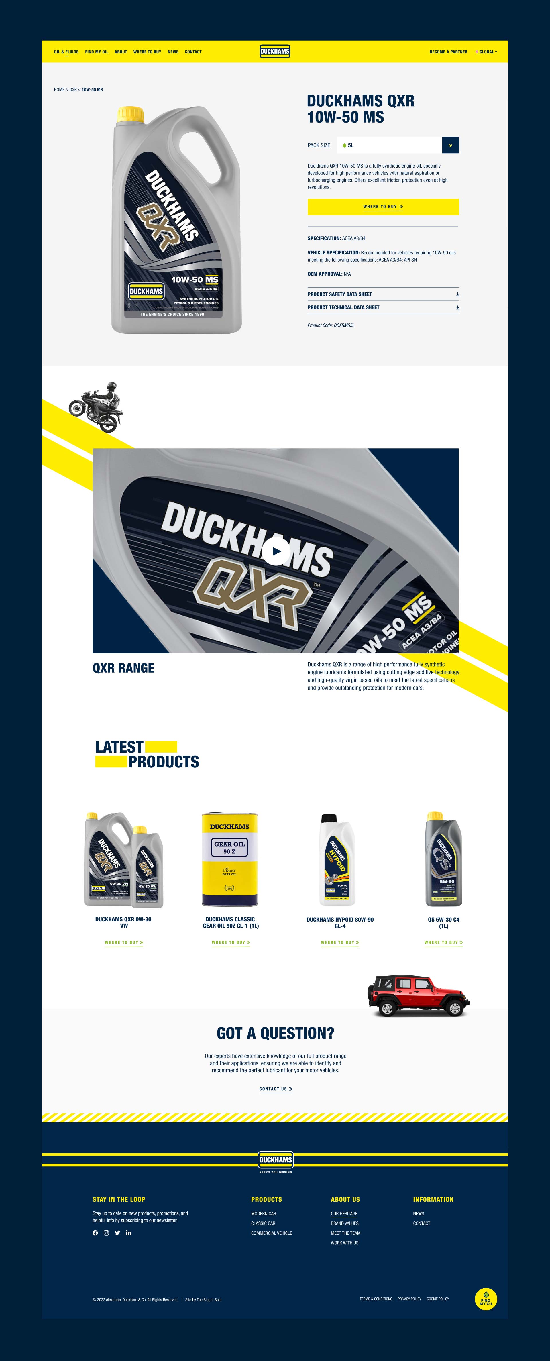
A key audience group was garages throughout the UK. As a result, the website needed to act as a quick reference guide to the Duckhams range, as well as a tool for sourcing the correct oil of whatever vehicle the garage was servicing.


How we've helped
With so much going on in Duckhams’ website, our development team felt it was important to create a website that could be easily managed so that the client could feel empowered to make changes in the future. As a result, we incorporated a block-based design that could be reused to create unique layouts while using bold animations and subtle transitions to engage users and offer a high-end feel.
These were: an API oil finder function (allowing users to search for specific oil based on their registration plate or selecting options), a custom distributor map (showing users their nearest stockist), and a bespoke heritage timeline (demonstrating the immense history of the brand in an engaging way).


Locating the oil finder
We were particularly tasked with ensuring the 'local garage' audience could locate our 'oil finder' within two seconds of landing on the website. We achieved this by placing the 'Find my oil' CTA button in three obvious positions.
This new website is the first of a global rollout of approximately 25 across Europe, the Middle East, and Asia Pacific regions, which is why we developed the site to streamline future launches as much as possible, sharing assets, functionality and content.

Jason Scarfe
Senior web developer, The Bigger Boat


