hoomph rebrand and website
hoomph is a HR consultancy for technology, biotech, gaming, the creative industry, and beyond. More than a service provider or crisis coordinator, hoomph’s specialism lies in its partnership approach to HR: becoming part of the team to drive growth for ambitious businesses. Formerly e-volveHR, they needed a rebrand that truly communicated the immersive and future-focused nature of the company, including a new website, tone of voice, and creative designs.


The challenge
Having originally supported e-volveHR with comms and media relations, we quickly ‘diagnosed’ that there were multiple e-volveHRs in the HR space. To stand out in the industry, a new brand identity and proposition was vital to differentiate from other consultancies, both visually and in its copy.

To coincide with the rebrand, a fresh, flexible, and dynamic website that truly communicated the brand’s unique expertise and approach was necessary to align with the new identity. Not only did it need to be visually compelling and engaging, but also highly functional, with a focus on user experience and responsiveness to boost performance, SEO visibility, and attract more people.
Our solution
Beginning with our brand workshop, we dived deep into e-volveHR to redefine its mission, vision, and values. We recognised that e-volveHR was more ‘future focused’ than other HR companies, getting to grips with the businesses and people they work with, rather than simply doing the ‘tick-box’ tasks. So, we proposed a new brand and website, which we kicked off while managing and maintaining a comms strategy. Taking the leap to a new name was a huge move for the brand, but necessary.
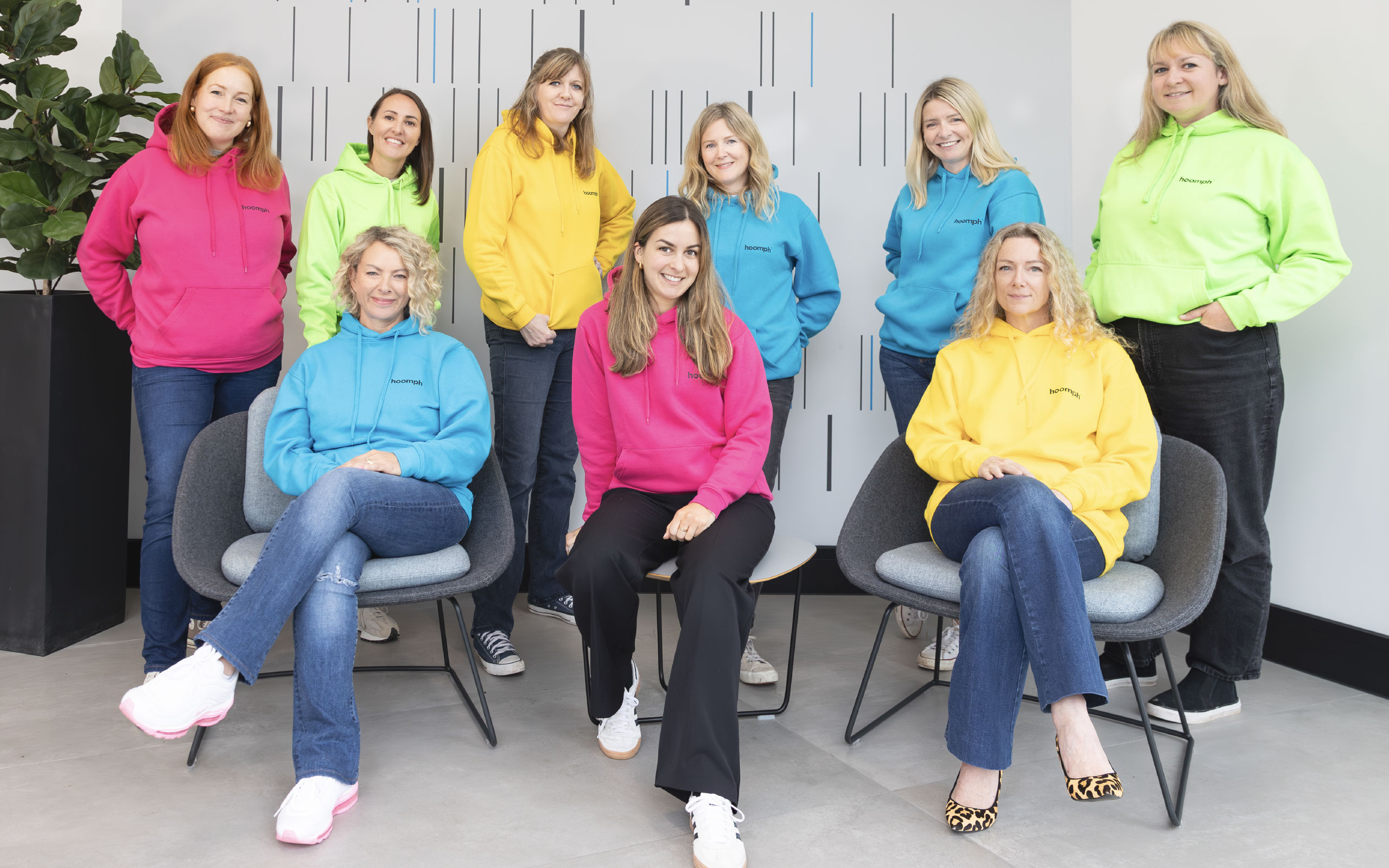
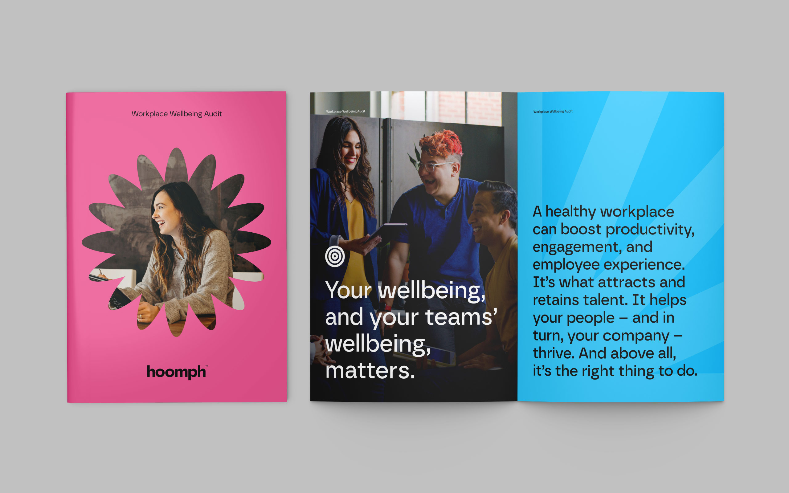
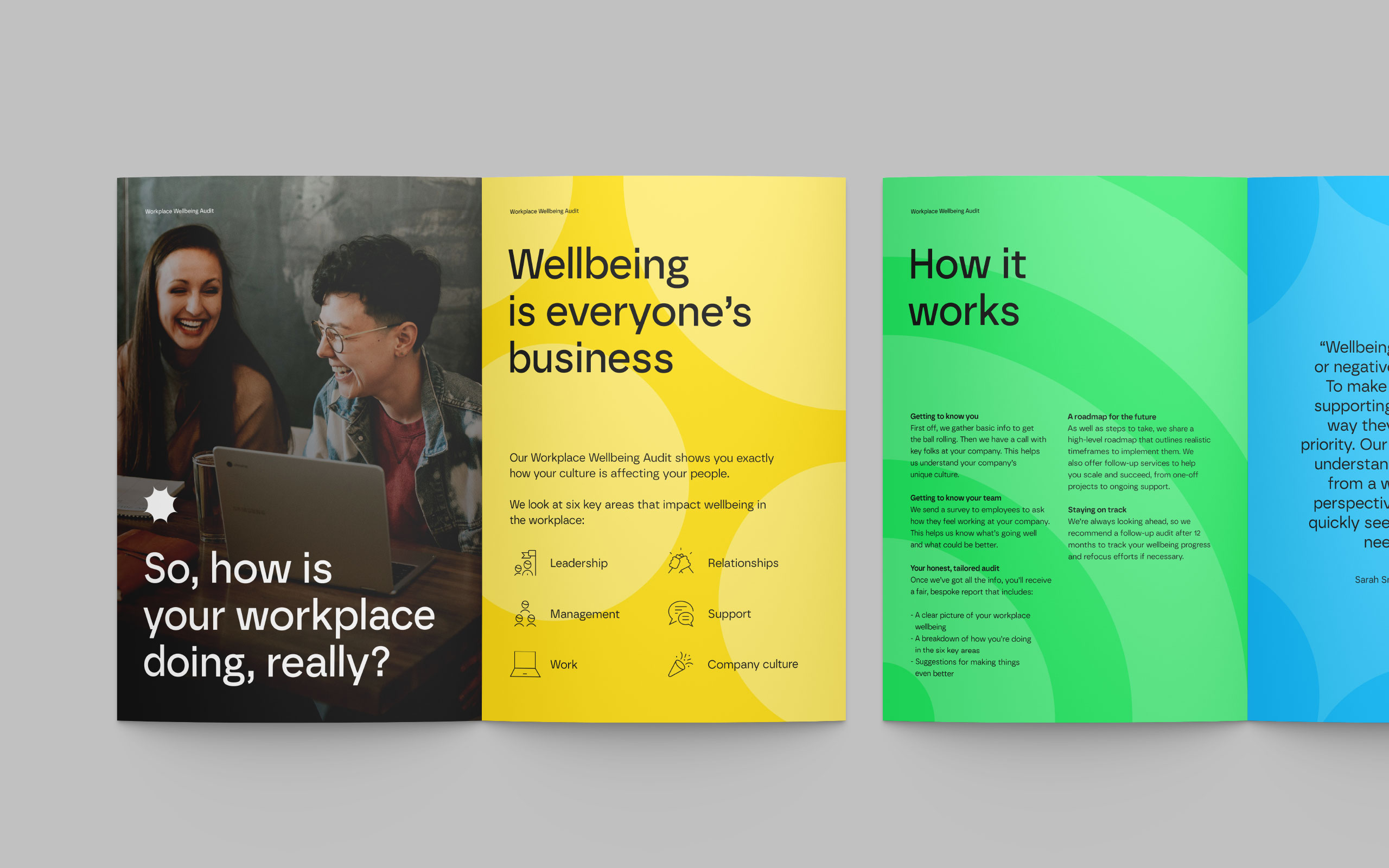
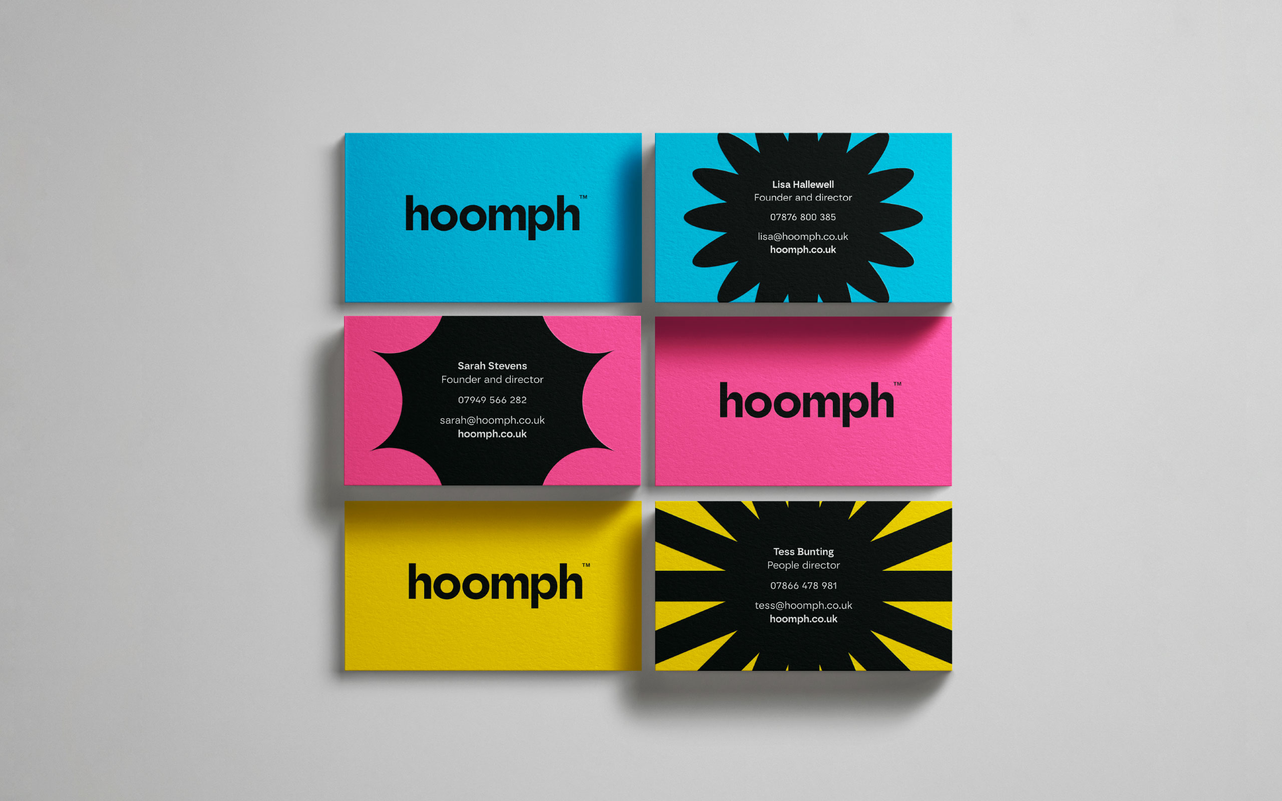
We renamed it hoomph (humans with oomph), designing a vibrant new logo with an ‘O’ that can adapt to different shapes to reflect the company’s creative industry niche, as well as the varied people and personalities they help.


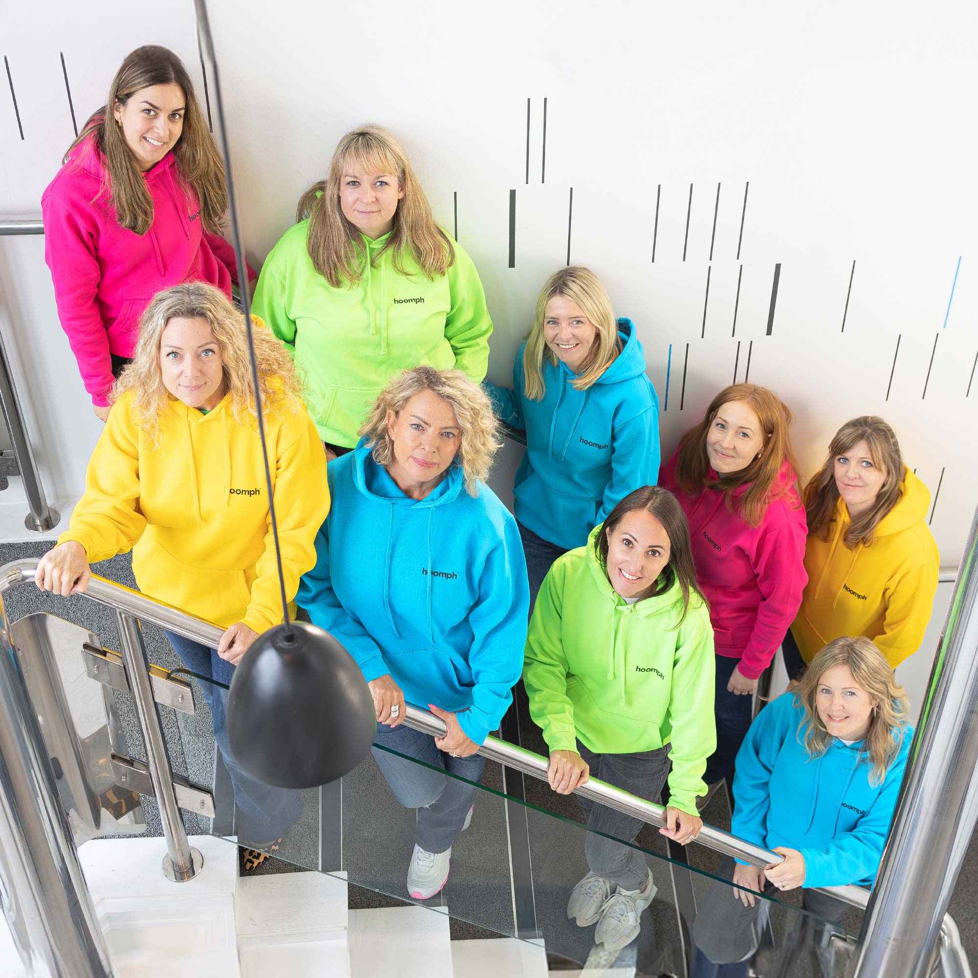
We implemented this fresh brand identity across the new dynamic website, which was redesigned using powerful CMS Statamic for enhanced user experience, maximum flexibility and performance, and easy manageability.

Doug Main
Creative director, The Bigger Boat


Lisa Hallawell
Co-Founder and People Director, hoomph


